REPACKAGING EVERNOTE
“Your Productivity Happy Place”
Evernote » 2021
— SKILLS EMPLOYED —
Creative Direction ・ Brand Messaging ・ Talent Casting ・ Copywriting
Tame your work, organize your life.
Evernote’s rollout of new features and subscription plans in 2021 was a watershed moment, a rare opportunity to reintroduce the brand to existing customers and prospects alike.
Task management, calendar integration, and a customizable Home dashboard had transformed a venerable note-taking app into a robust platform for managing your day and getting things done. Instead of just taking notes, now customers could take action, too.
New subscription plans made it easier to fit Evernote to specific needs, whether customers wanted to manage home and family life, become more effective at work, or get in sync with a team.
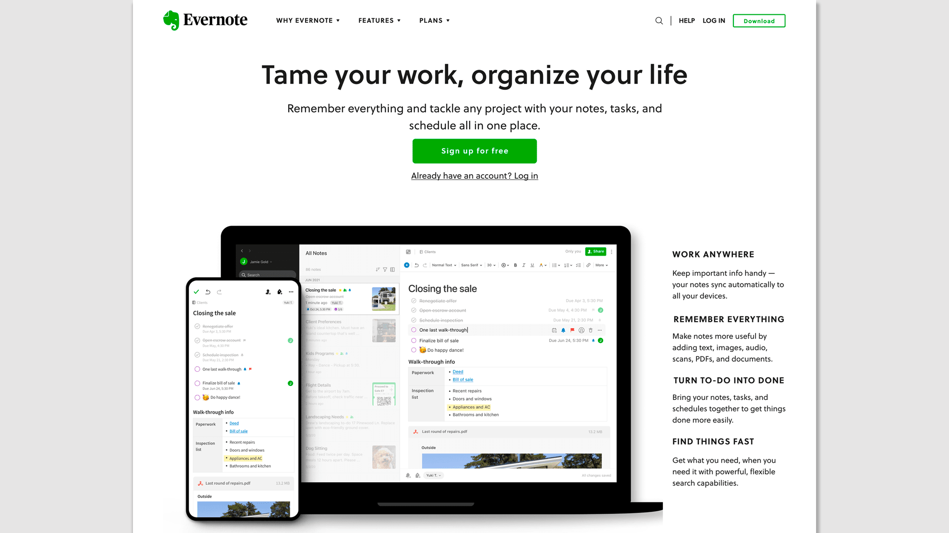
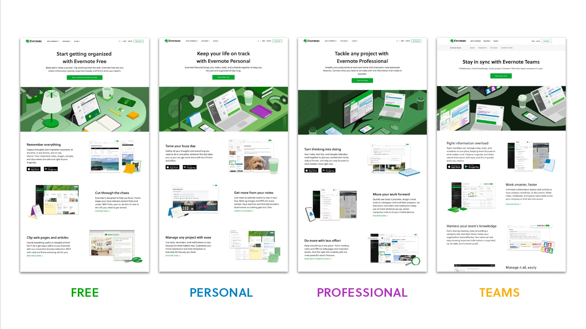
Welcome to your happy place
Together, these changes can make Evernote your productivity happy place—whatever that means to you.
My job was to bring this message to life.
I guided Evernote's marketing designers and copywriters through a campaign that crossed video, web, email, blogs, PR, help content, and social media. I also built a set of interlocking messaging frameworks that made dry value propositions more relatable. And I got my hands dirty by writing website copy.
Reintroducing Evernote
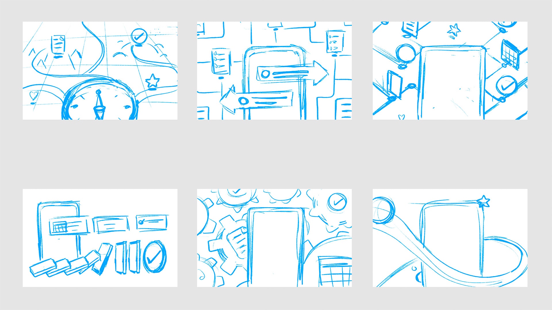
The centerpiece of the project was a short, fun video that showcased how notes, tasks, and calendar combine to solve genuine problems. We did this by contrasting the cluttered world outside the app with the clean, organized experience of using Evernote.
Everything from concept to scripting, direction, and production was handled in-house. I helped the creative team arrive at a logical flow that could keep viewers engaged and sorted through hundreds of auditions to select five voice actors who could carry it off.
Getting the ball rolling
The video is evergreen, but our launch campaign had to speak to the moment.
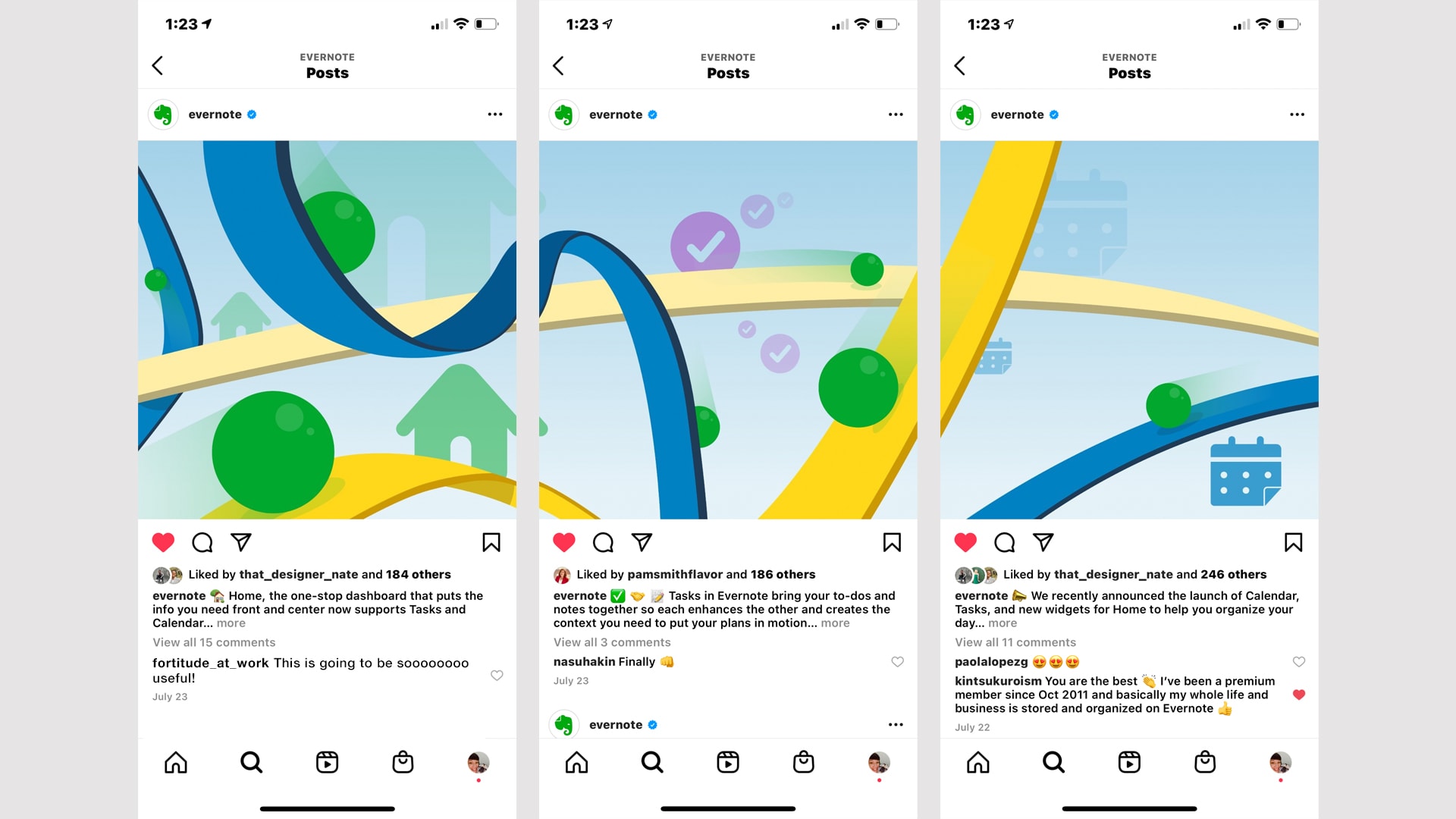
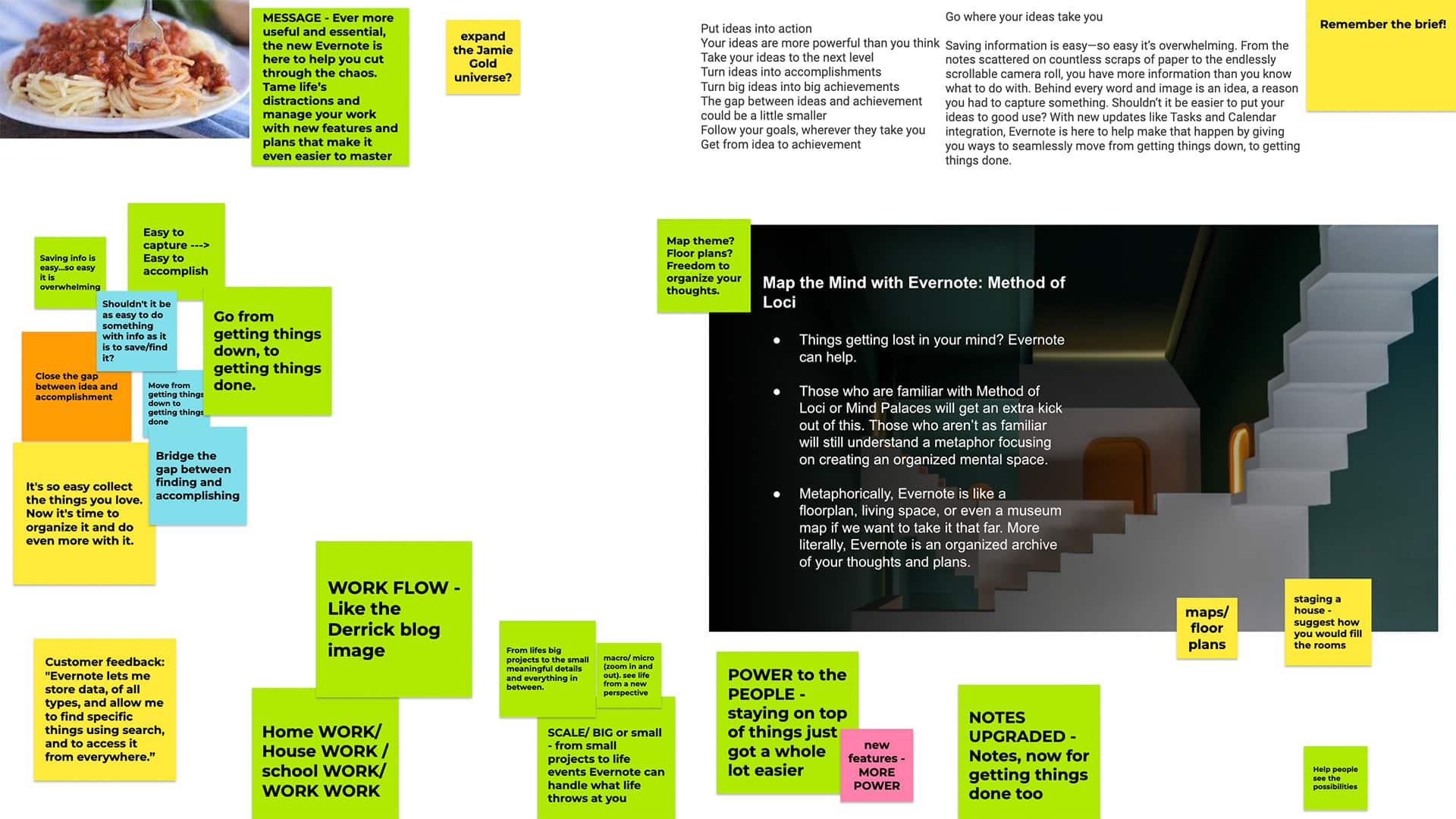
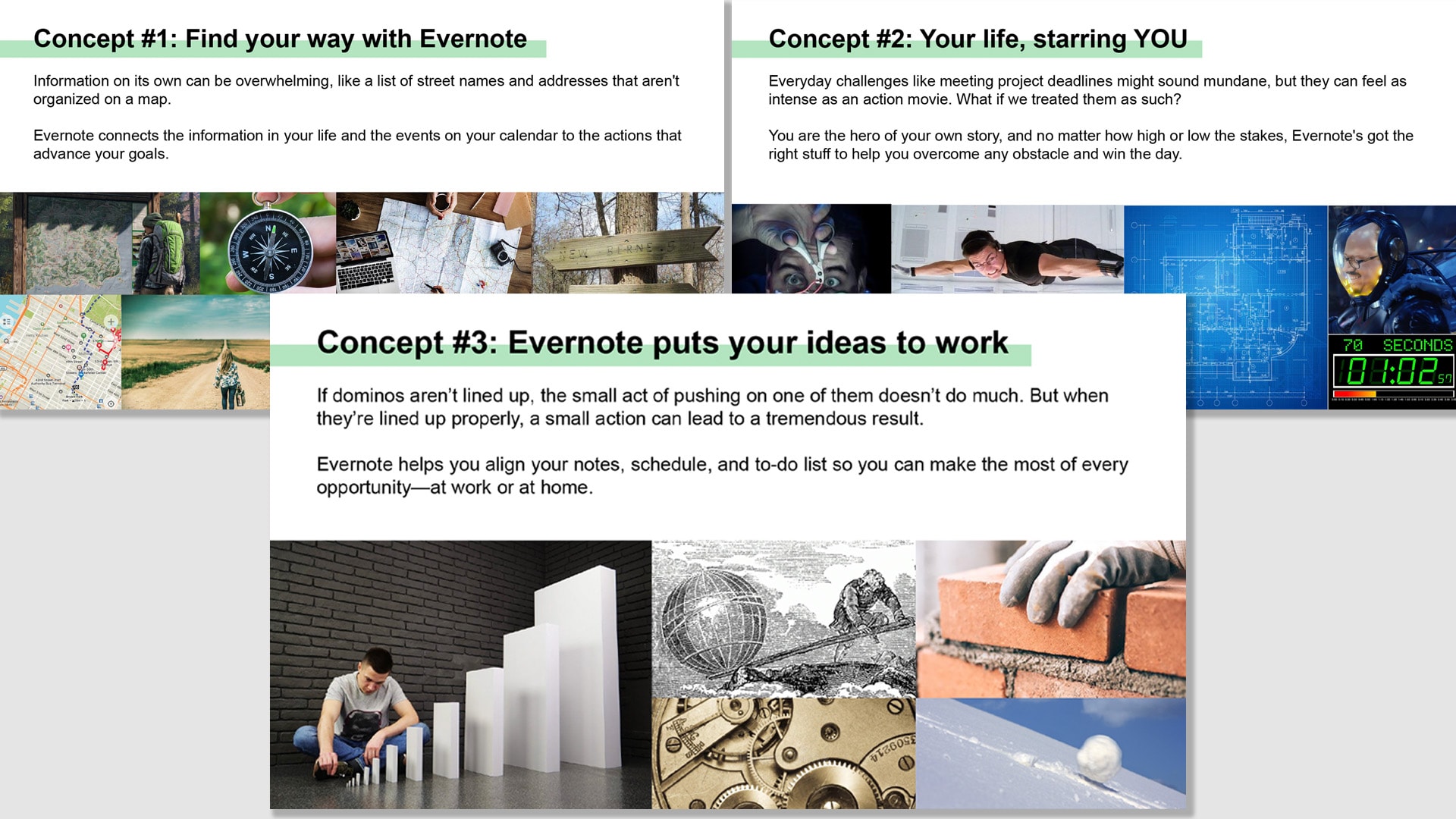
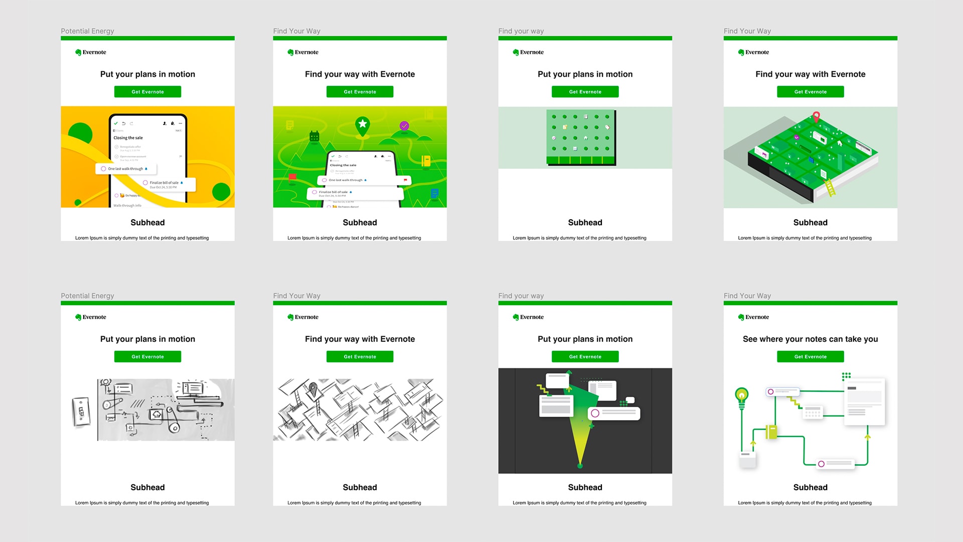
After considering high-concept directions like portraying everyday challenges as scenes in an action movie, we settled on the simple idea of “perpetual motion.” This theme delivered the message that once you get started with Evernote, we’ll help you “keep the ball rolling” towards your goals, easily and smoothly.
We brought secondary brand colors to the fore for an unexpected look, while pops of our signature green and screenshots of the app maintained continuity.
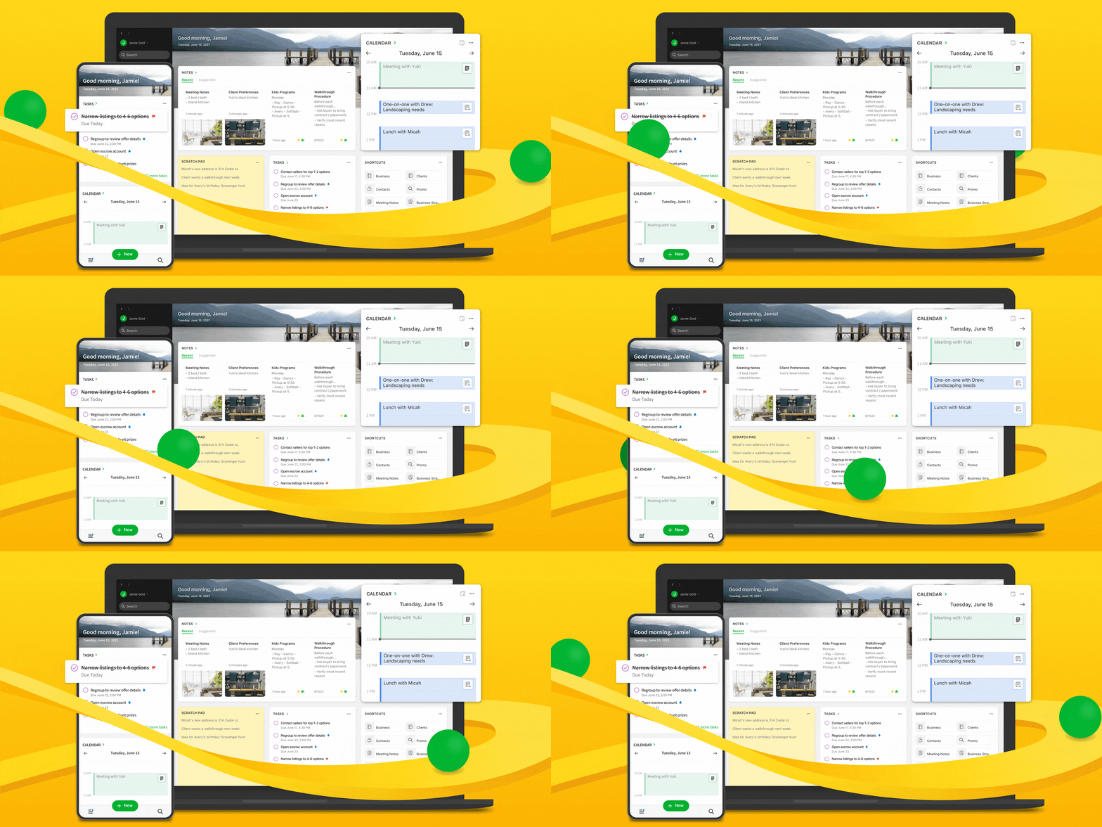
Our theme also reflected the evolution of the company. For years, some customers perceived us as static and unresponsive. But now we were shipping frequently and constantly improving, creating our own state of perpetual motion.
Bringing it all together
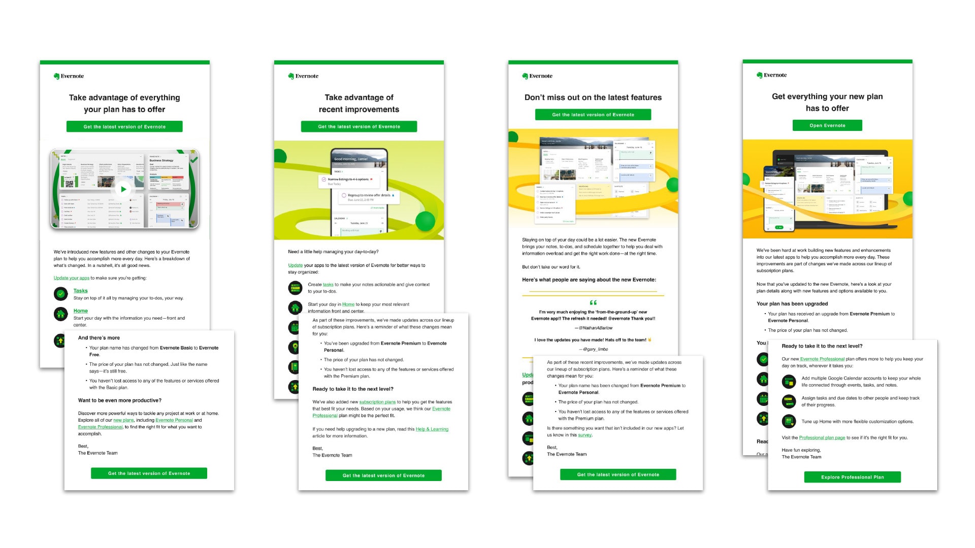
Throughout channels, we had to focus not only on what was new, but what it all meant. We had to speak to a hugely expanded addressable market without alienating the millions of long-standing customers whose experience with Evernote was about to change. It wasn’t enough to make that transition painless. It had to be exciting, too, encouraging people to update the app to see what they were missing.
Every piece of the campaign reflected an integrated messaging framework I wrote and refined following deep conversations with the CEO and marketing executives.
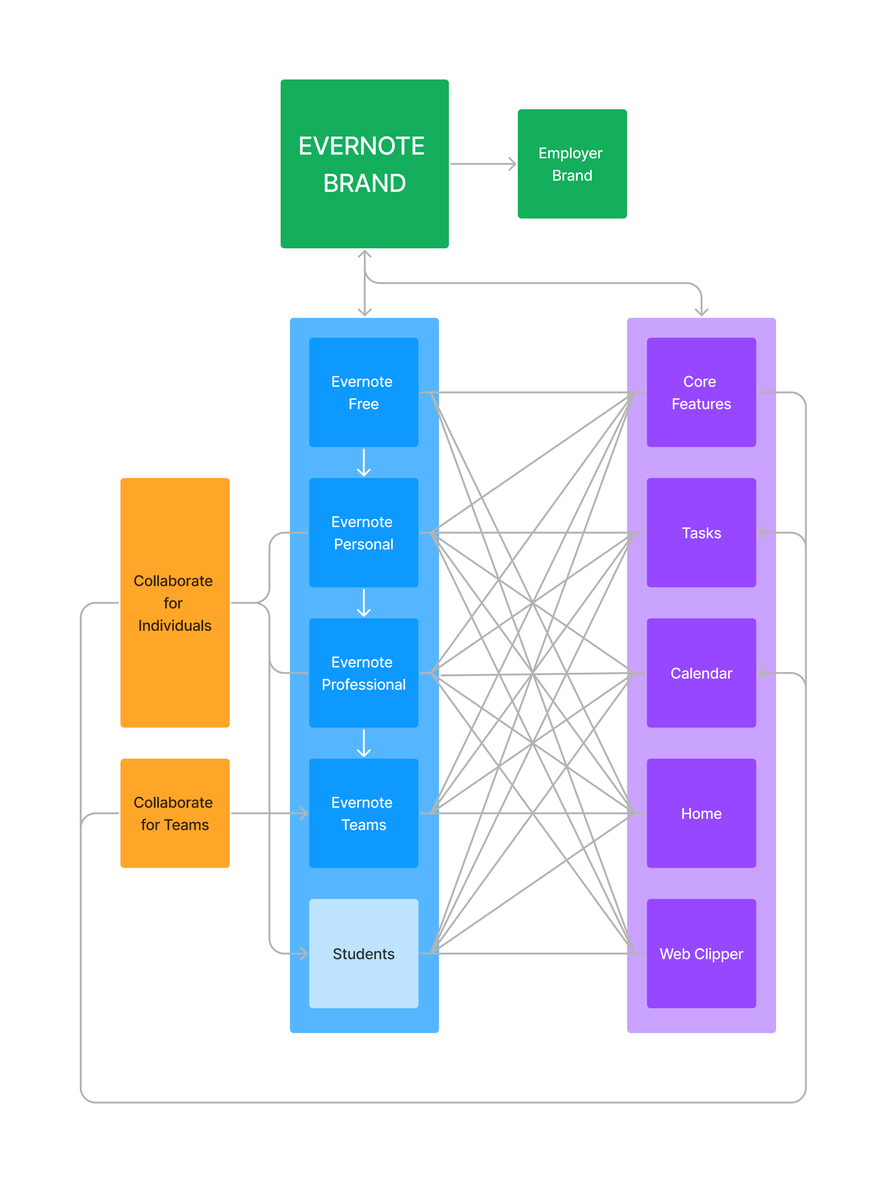
These frameworks all connect to each other to form a brand system. By showing how the product’s core features and tiers work together, they make it easy to explain how Evernote makes a customer’s life and work better.
Results
- 25% lift in customers converting to a paid tier
- 35% lift in people wanting to start a free trial
- Email resulted in ~30% of users becoming active on a repackaged client version within 7 days of receiving the email
- Video increased Instagram social media engagement by 5%
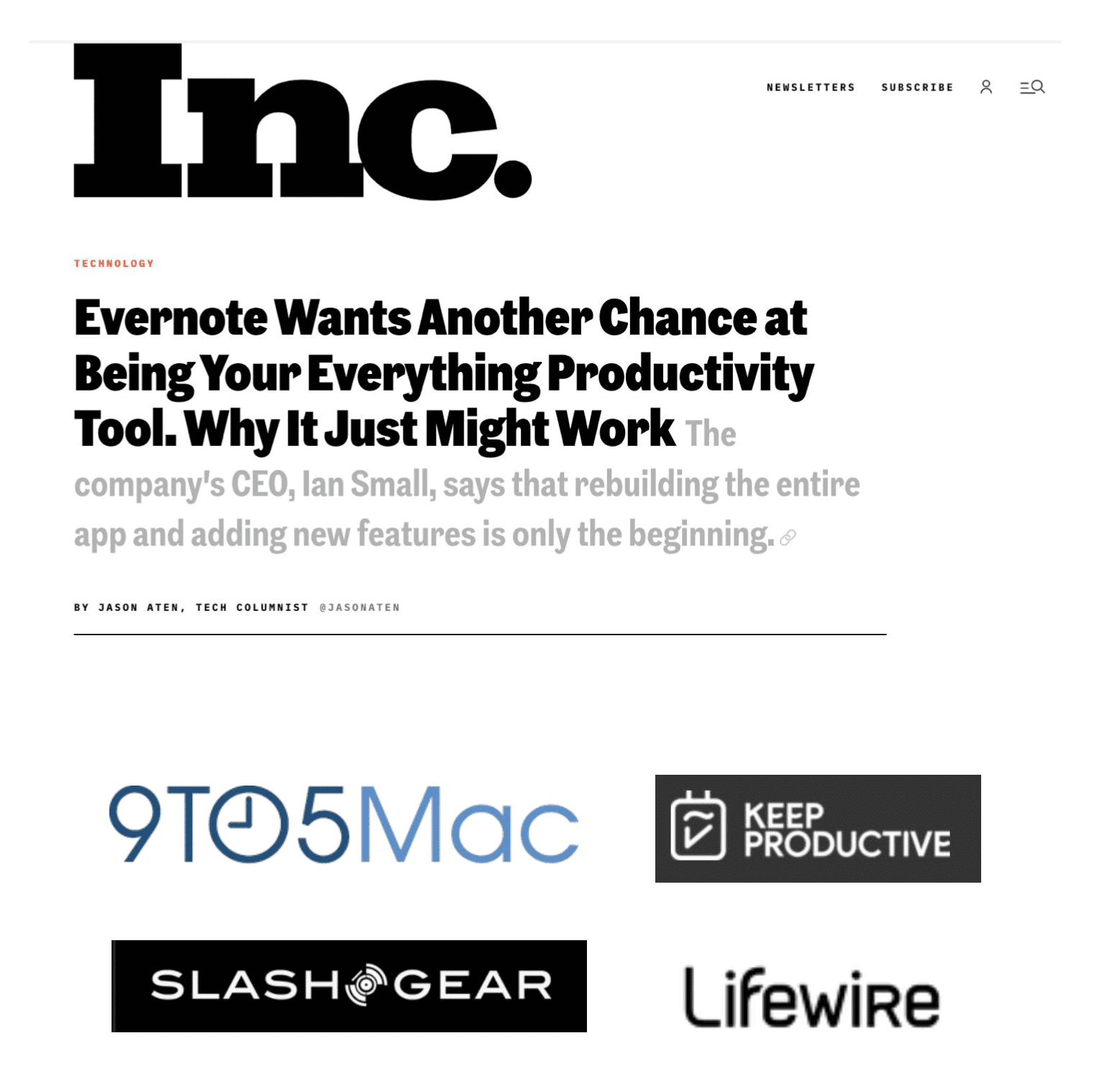
- Images were used across media outlets that reached 400 million UVMs
Team
Creative Direction
Forrest Bryant
Design
Nathan Au, Jaime Chong, Ralph Pato, Qianqian Wang
Copywriting
Barbara Atkinson, Anthony Bartlett, Forrest Bryant, Brian Daignault, David Perez
Video & Animation
Joshua Kidwell
Project Manager
Lisa Van Tassel
Explore Fo's Folio

Writing SamplesVarious Projects
Creative DirectionRecent work
Focus CultureEditorial / Strategy / Talent

The Ever Better ChallengeEditorial Direction / Talent
Evernote Brand RefreshEditorial Direction
Coffee & Quill SocietyCreative Direction / Copywriting