EVERNOTE BRAND REFRESH
Focus on what matters most
Evernote » 2018
— SKILLS EMPLOYED —
ACD / Brand Messaging / Voice & Tone / Editorial Direction / Podcasting / Ad Copy
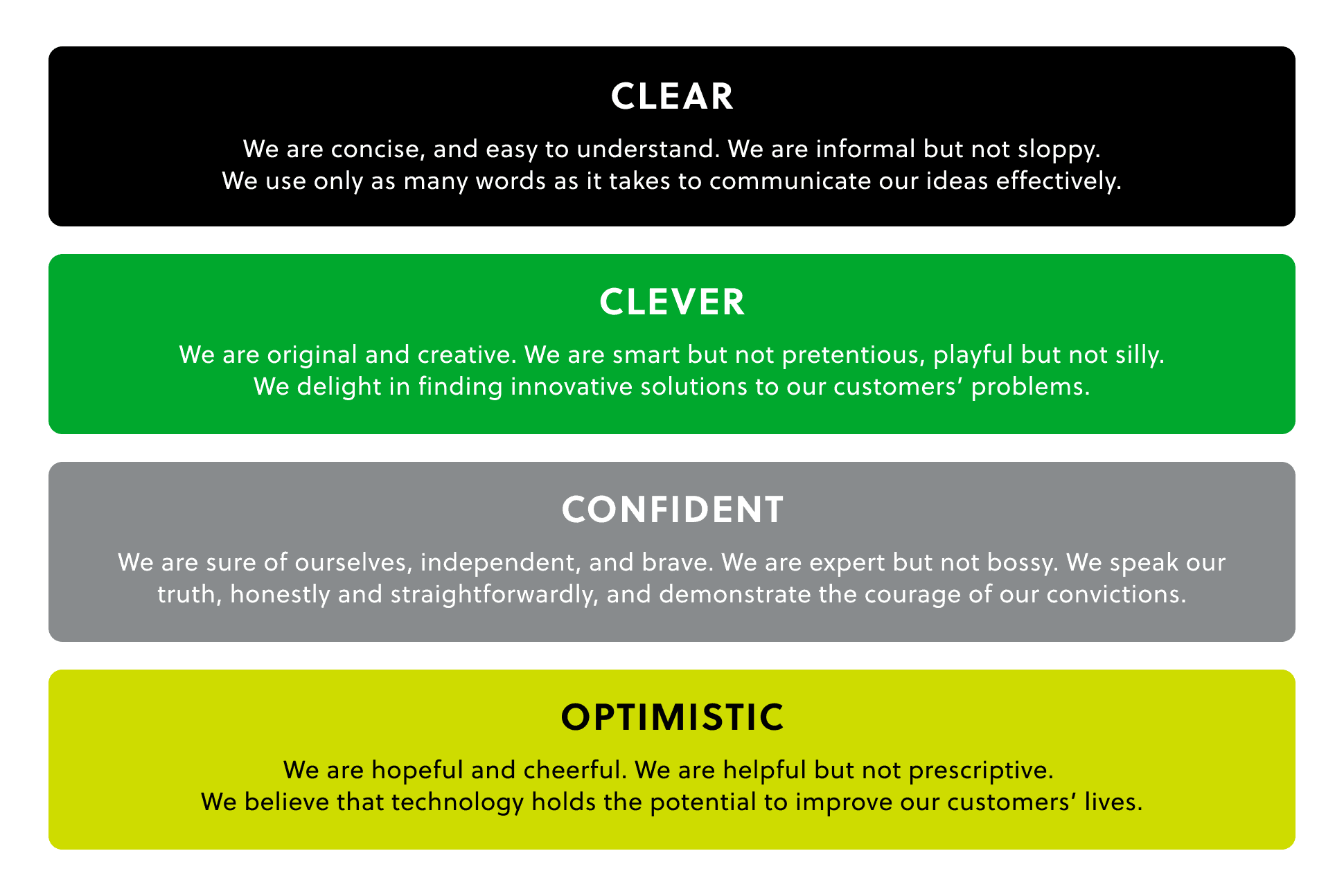
Clear, clever, confident, optimistic
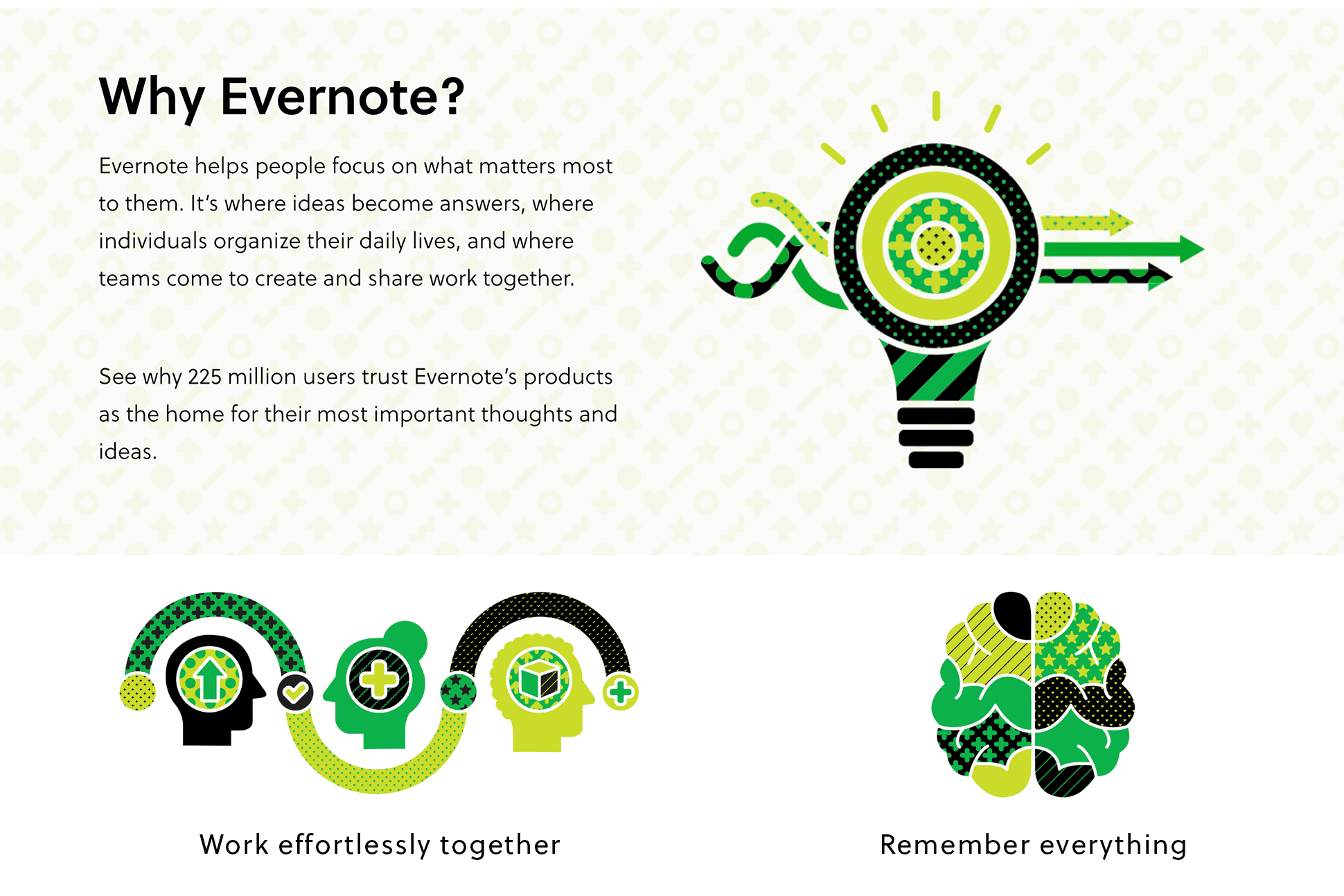
Evernote’s brand has always been synonymous with remembering what's important. But as the company approached its 10th anniversary in 2018, the brand needed a realignment. We needed a fresh solution that could grow Evernote’s sphere of influence from notes and memory to deep work and accomplishment. But we had to do it without losing our heritage.
Evernote worked with the acclaimed global agencies DesignStudio and TBD to modernize the brand, which was rolled out in the summer of 2018.
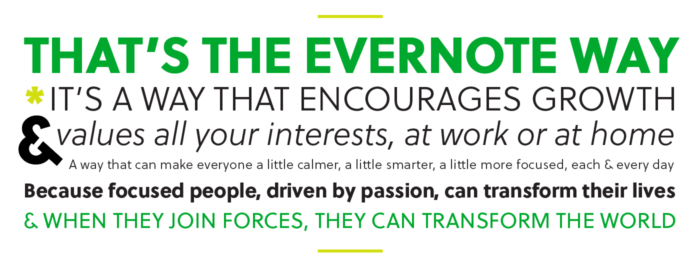
My role was to translate the brand’s DNA, vision, and attributes into a simple set of concrete messages. I wrote a new Evernote brand story and overhauled our voice & tone guidelines, setting the direction for all marketing copy going forward: clear, clever, confident, and optimistic.
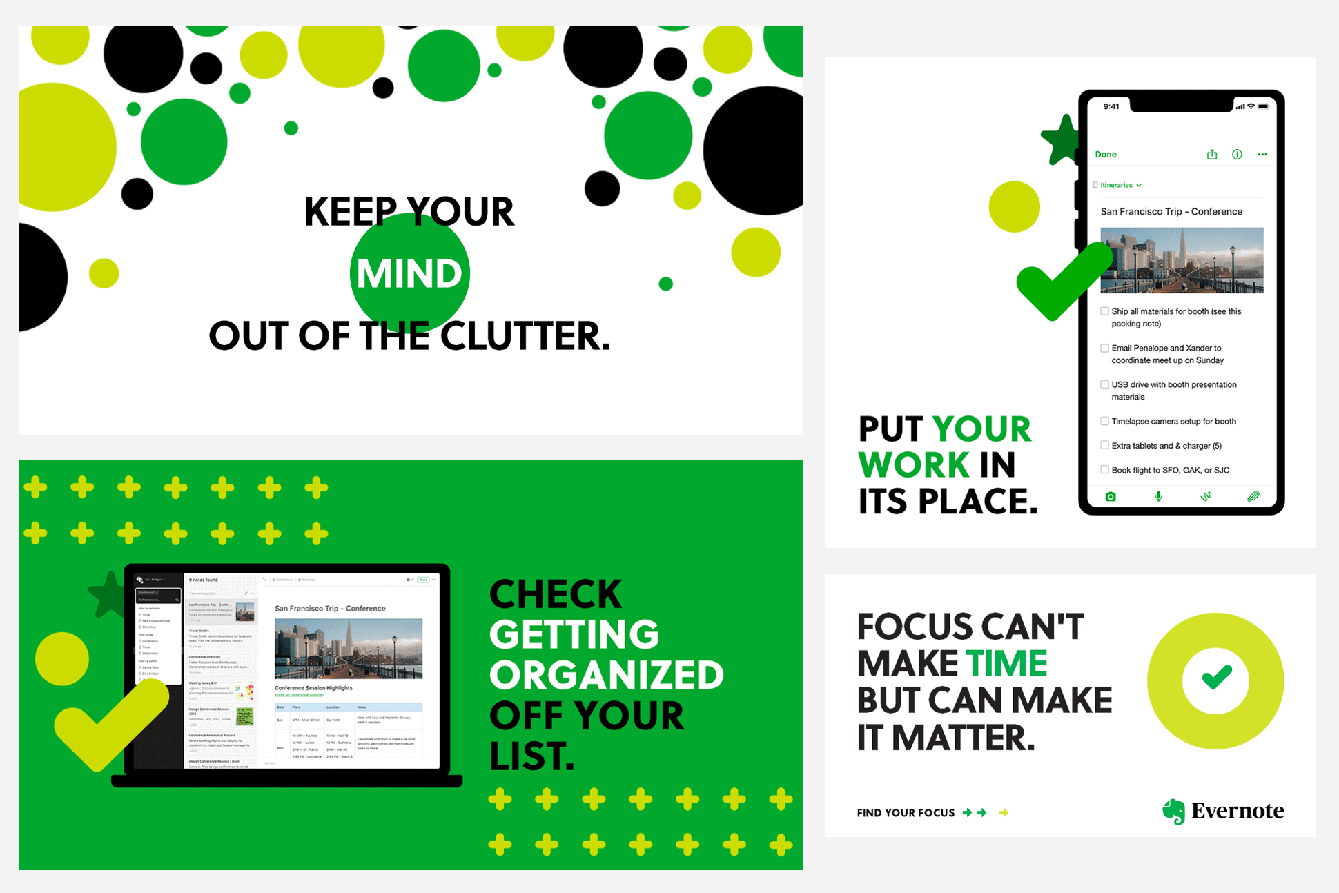
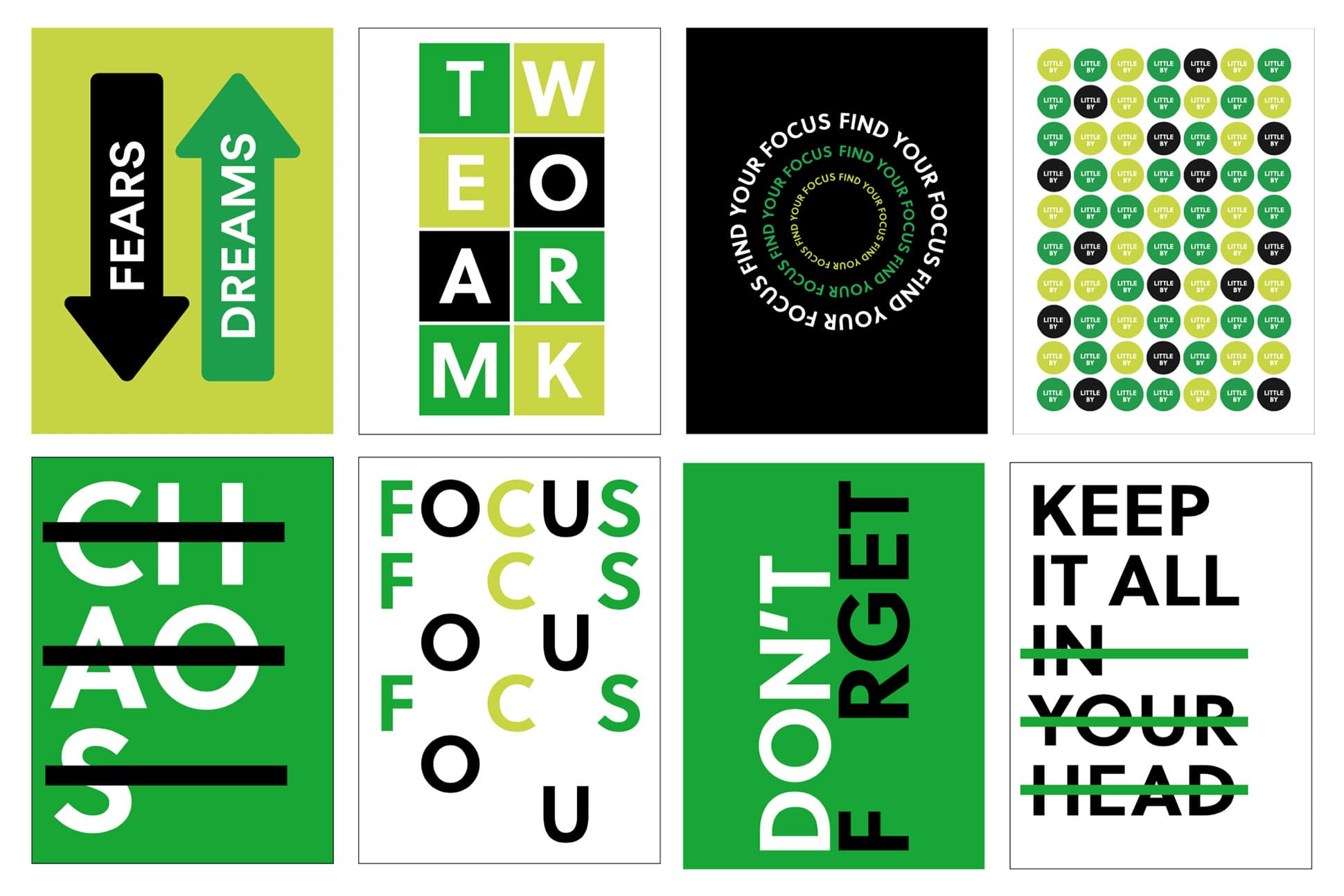
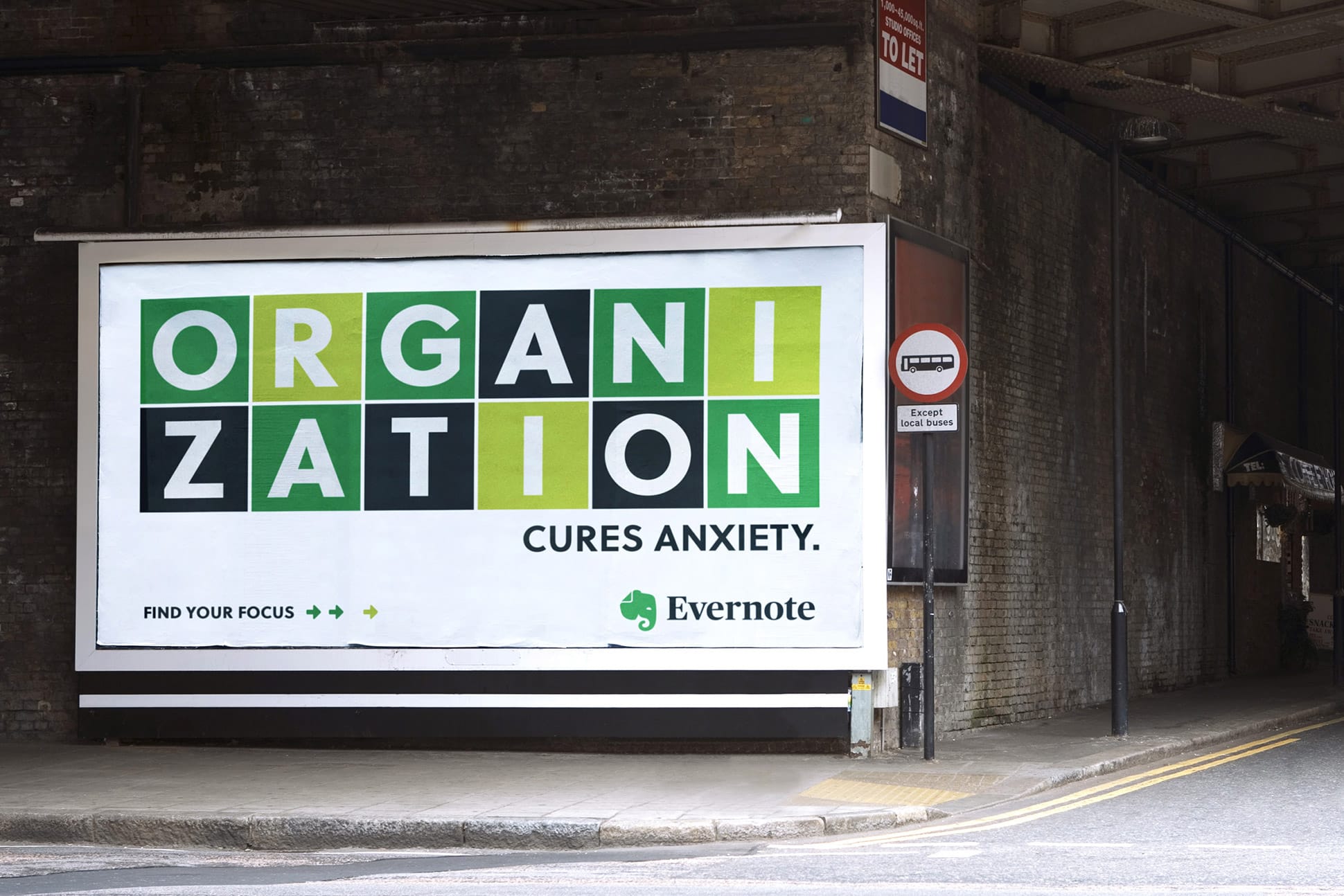
For our copywriting, I developed a new brand story and editorial style guide that shifted the brand from the narrow message of “note-taking” to a more open, aspirational message of focus. Focus provides meaning to our lives, helping us find new ideas and turn them into actions. It is the heart of productivity, making our lives and our world better.
Over the course of the project, my role expanded. I gave key input into our logo and emerging design system, appeared in videos and photoshoots, edited external comms, and developed a variety of OOH and digital ad copy.
Evolution, not revolution
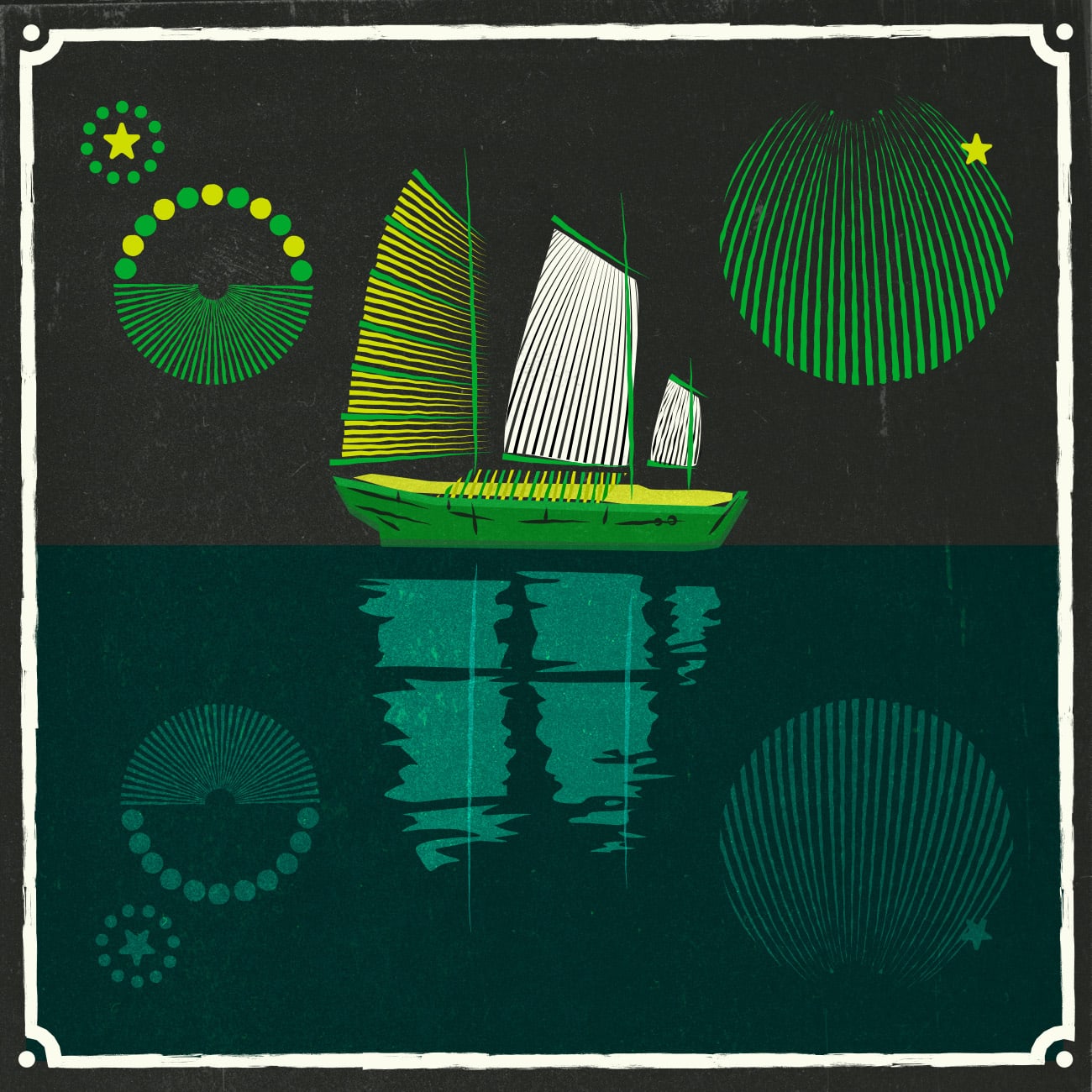
Throughout the process, we focused on our unique attributes while opening up new avenues for expression and growth. Evernote had always been associated with the color green, so we pared down to a strong green and black color palette, shifting from a reliable yet stodgy look to one that balanced modernity and timelessness.
The most recognizable part of Evernote’s brand is our beloved elephant logo, nicknamed “Mads.” The logo symbolizes Evernote’s promise to help you “remember everything,” in a nod to the folk saying that elephants never forget. The distinctive fold in Mads’ ear carries more messages, suggesting the icon for a document file or the dog-eared page of a book.
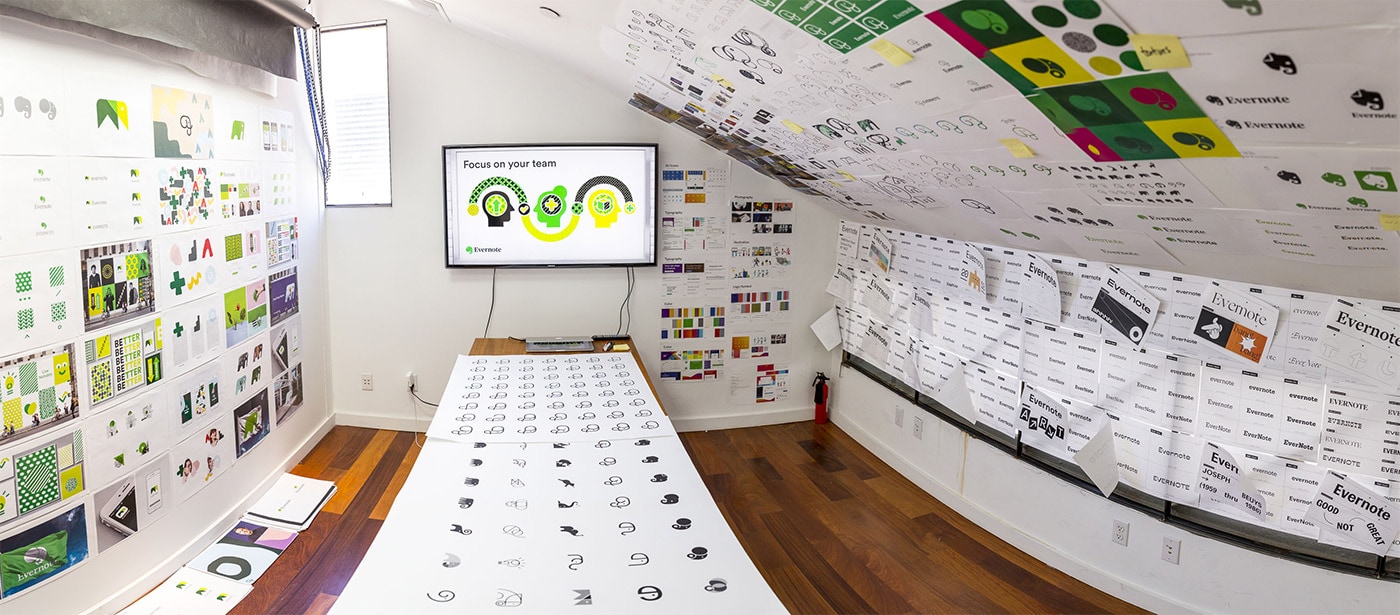
DesignStudio explored many new directions for Mads, from realism to pure abstraction. But as the in-house team winnowed down to a solution, I argued for gentle refinement as a way to maintain the recognition and brand capital Mads had built over the years. The team adopted my point of view, and Mads became a friendlier yet still familiar icon, now with a smoother, more streamlined geometry. We also switched the elephant from a bland gray to a confident, vibrant green.
Becoming Ever Better
Good typography is vital in any brand. We avoided the fad for sleek yet soulless sans-serifs, instead opting for Publico to give our logo a classic, timeless feeling. Elsewhere, we used Soleil, which is open, clean, and versatile. Typographic art using Soleil was a major part of our brand launch, combining with the messaging I had crafted to make bold statements. I explored these aspects and more with Evernote's Creative Director and SVP of Brand in a special episode of our Taking Note podcast:
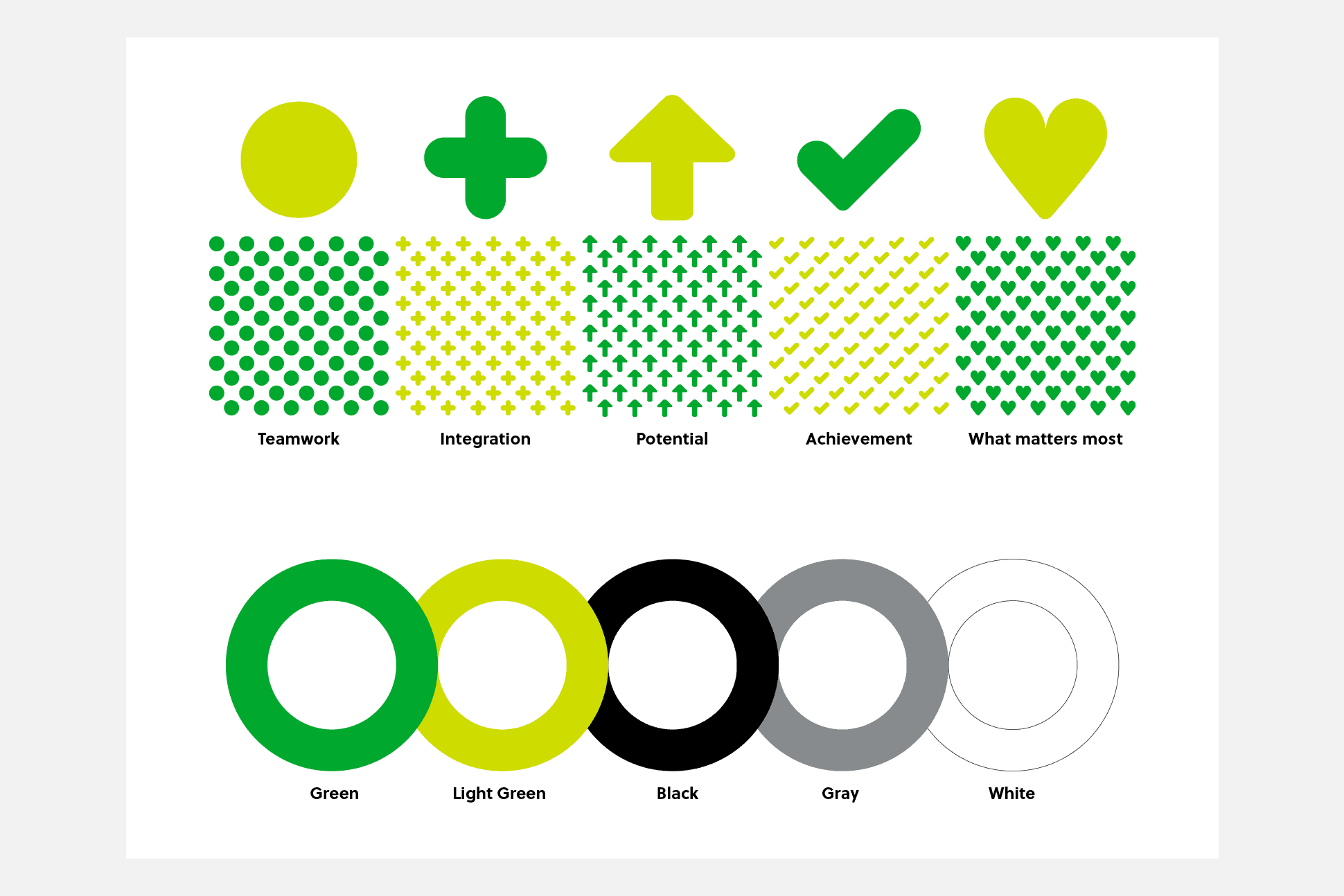
In illustration, we moved toward a flat, geometric style that elevated the brand's assertiveness in a bold, appealing way. We then sprinkled these visuals with “ever better dust,” a set of symbolic shapes and patterns developed by DesignStudio. Each symbol represents an aspect of the brand’s promise, providing a layer of subconscious messaging in our visual assets.

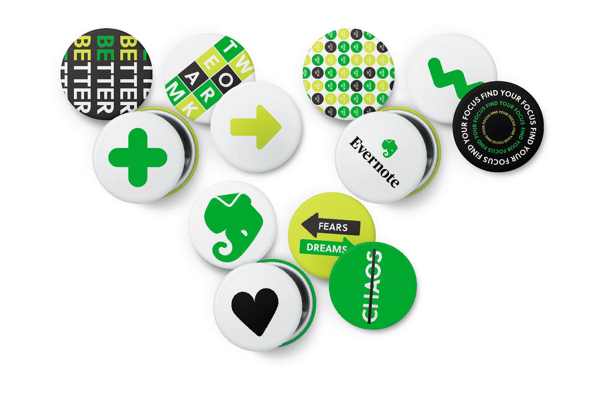
Remember everything, accomplish anything
As we pushed the brand forward, we also took care to honor the past. Evernote began with Stepan Pachikov’s vision of extending the human brain. Stepan dreamed of technology that would free humanity from the fear of forgetting, forever. This simple yet powerful idea set the stage for everything the company does. We hired famed portrait photographer Mark Seliger to help us retell Stepan’s story, yielding striking images and a touching short film. Audio for the film came from hours of interviews I conducted with Stepan during the shoot.
Since becoming Evernote’s Creative Director in 2019, it has been my job to nurture and grow Evernote's brand messaging and visual expression, guiding it through a new, dynamic phase of the company’s development. As Evernote expands beyond note-taking into a broader view of productivity and accomplishment, our brand stands ready to bring that vision to the world.
Response
“The most valuable asset of the brand refresh was a renewed awareness and deeper understanding and expression of the brand's flesh and bones, which is more important than ever.”
— Inc. Magazine
Team
Agency Partners
Design.Studio, TBD, Mark Seliger Studio
Creative Direction
Jonathan Woytek
Brand Team
Francie Strong, Cassie Shaine, Amanda Downey
Design
Robert Konves, DJ Murphy, Jessica Stanell
Copywriting
Forrest Bryant, Anthony Bartlett
Video & Animation
Joshua Kidwell
PR
Shelby Busen, Taylor Mikolasy
Social Media
Cindy Qiu, Melissa Santiago, Dorothy Spira
Producer
Stacy Leigh Bailey
Explore Fo's Folio
Writing SamplesVarious Projects
Creative DirectionRecent work

Repackaging EvernoteCreative Direction / Copywriting
Focus CultureEditorial / Strategy / Talent
The Ever Better ChallengeEditorial Direction / Talent
Coffee & Quill SocietyCreative Direction / Copywriting