
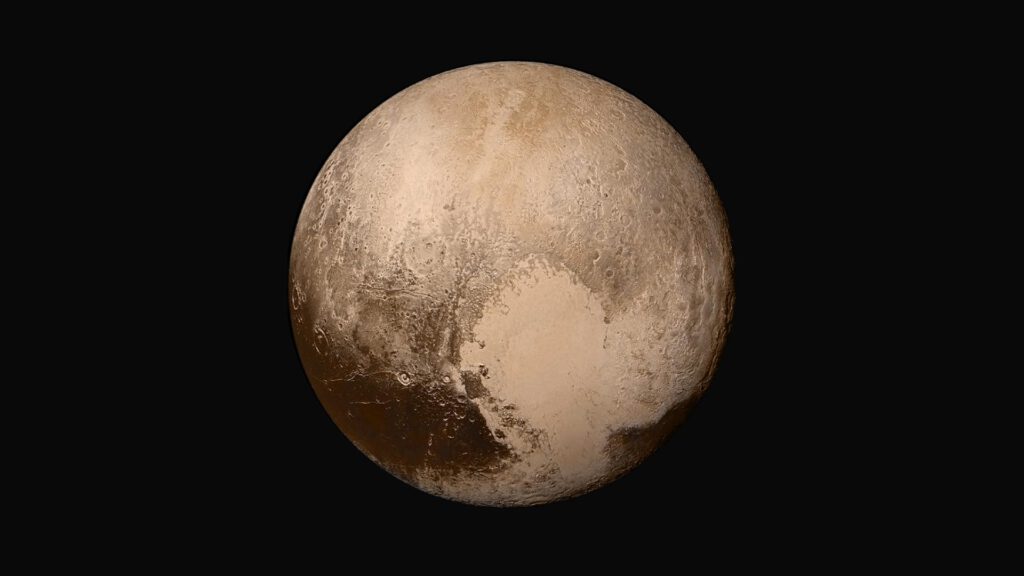
This week, scientists and space buffs are giddy with excitement over the first high-resolution images from Pluto, as transmitted in intermittent bursts by the New Horizons flyby probe.
It’s been almost ten years since Pluto, a frozen orb that spends most of its time beyond the orbit of Neptune, got reclassified. Once drilled into our heads as the solar system’s ninth and most distant planet, now it’s just another body in the Kuiper Belt. It’s not a “planet” as most astronomers define the term, nor is it the outermost object in the solar system. But Pluto retains the public mystique it’s held ever since it was first discovered back in 1930. Everybody loves Pluto.
And so we get up early in the morning to watch as new images are unveiled in NASA press conferences. We pore over the photographs and give the features cute names: the Heart, the Whale. Pluto takes over the front pages of online news outlets and trends hard on social media.
As I was sipping on my first cup of coffee this morning and staring at the latest stunning image, I was struck by a comment from one of the New Horizons scientists: the images we see first are not the raw, high-resolution images the probe took. They’re greatly compressed versions, like lossy JPEGs, and we get the originals much later. The idea is that people want to see the images as quickly as possible. That’s just human nature. But we also need the fine details so physicists, planetary scientists, and geologists can do their science. So New Horizons sends the images twice: a quick-and-dirty version first, then the high-res when there’s more time.
This makes a lot of sense, and as someone who works with online content, it’s a familiar pattern.
The dance of “done” and “perfect”
In the 24-hour news cycle, networks get a camera on scene first and then the analysts try to figure out what it all means over the following days. In large-scale web content projects, we tend to go after the top-tier pages first to get the basic message in front of most users right away, then fill in the details in a second phase covering the rest of the website. In software design, product managers scope down to the minimum viable product (MVP), get that out the door quickly, and then iterate with feature releases to get to the product they really want. It’s a simple method, and it works so well it’s even become a start-up mantra: Done is better than perfect.
Maybe. But we still need to strive for something better. Think about those examples above. Those quick images from Pluto keep interest high and drive social shares, but planetary scientists need hard data, not just grainy shadows. The news-watching public needs facts and not just shocking “eyewitness” images. Your customers need to see unified messaging whether they land on your home page, a product support page, or a buried FAQ. And your team needs the satisfaction of knowing they didn’t just get “something” released, they didn't just hit a milestone; they actually achieved what they set out to achieve and made a great product that lasts.
Too often, we think of these post-release add-ons as merely “nice to have,” as opposed to the first release MVP that anchors the business roadmap. This is understandable; in business, it’s important to keep moving forward. But simply moving is not enough. If you don’t pause to fill in the gaps you’ve opened, if you don’t take the time to refine and improve what you release, all you have at the end are some grainy photos of Pluto: briefly dazzling, but ultimately unsatisfying. Don’t forget to give us the high resolution we were really looking for.
This post was originally published on LinkedIn Pulse